Overview
Online shopping in Nigeria continues to grow, yet many platforms overload users with cluttered interfaces, inconsistent flows, and friction points that discourage repeat purchases.
This project involved creating a mobile web-based e-commerce app inspired by Jumia, with a sharp focus on improving ease of use, trust, and enjoyment.
The aim is to reimagine the familiar Jumia-like experience, crafting a platform that feels intuitive, responsive, and personalized — ultimately making customers want to come back.
Research & Discovery
User interviews and lightweight surveys highlighted recurring patterns:
Frustration with slow load times and clunky mobile interactions.
Overwhelmed by too many simultaneous offers and banners.
Uncertainty around product authenticity and delivery timelines.
Preference for fast reordering or discovering trending items with minimal taps.
This pointed us toward building an interface that prioritizes trust, speed, and emotional comfort, layered with subtle delight to keep engagement high.
User Preferences
Users consistently valued:
A clean, visual-first layout with ample breathing space.
Prominent trust signals: badges for verified sellers, delivery estimates upfront.
A “Continue Shopping” flow that remembers them and makes discovery feel effortless.
One-tap reordering and wishlist functionalities.
Smart microcopy — telling them exactly what to expect next.
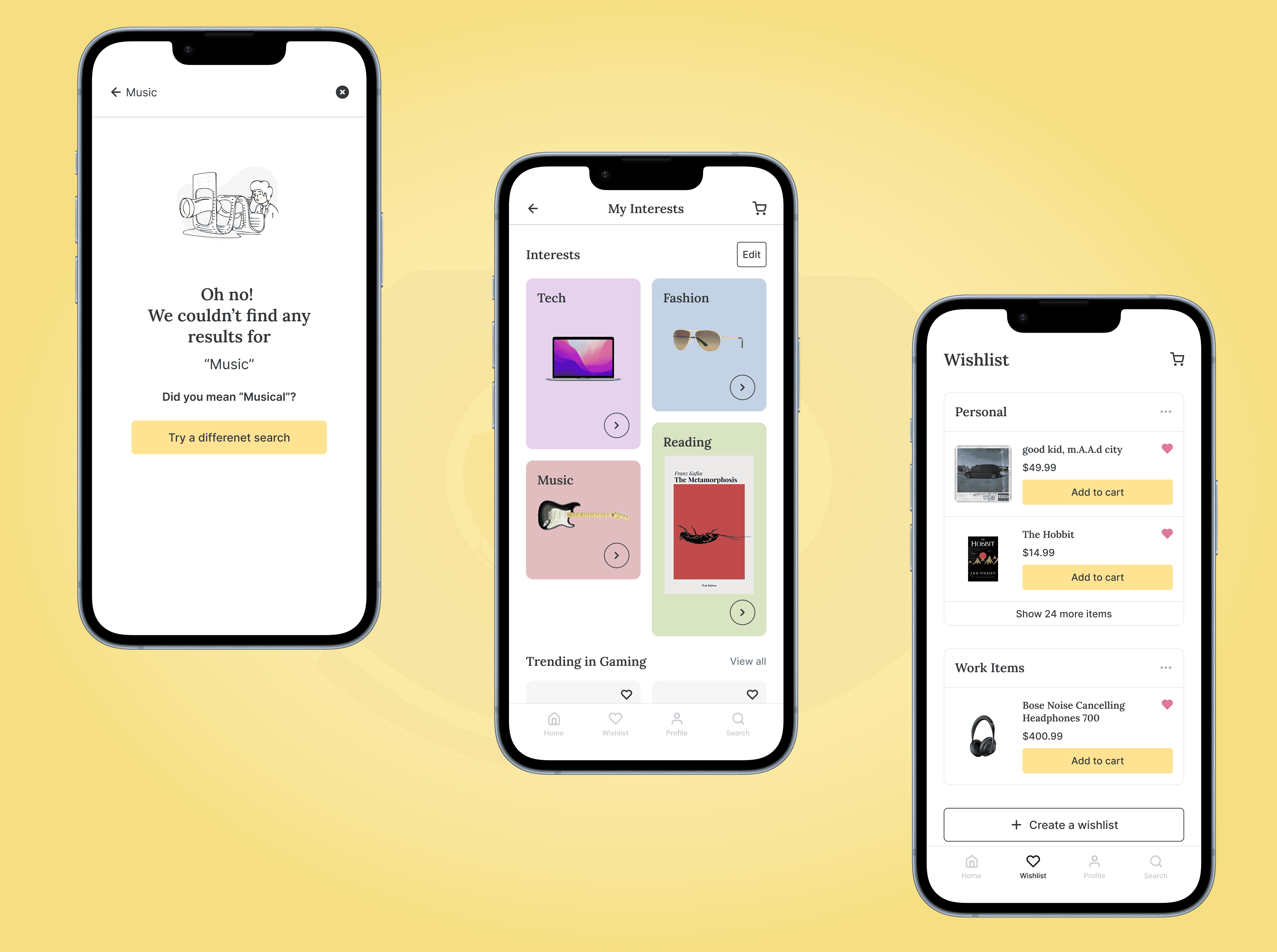
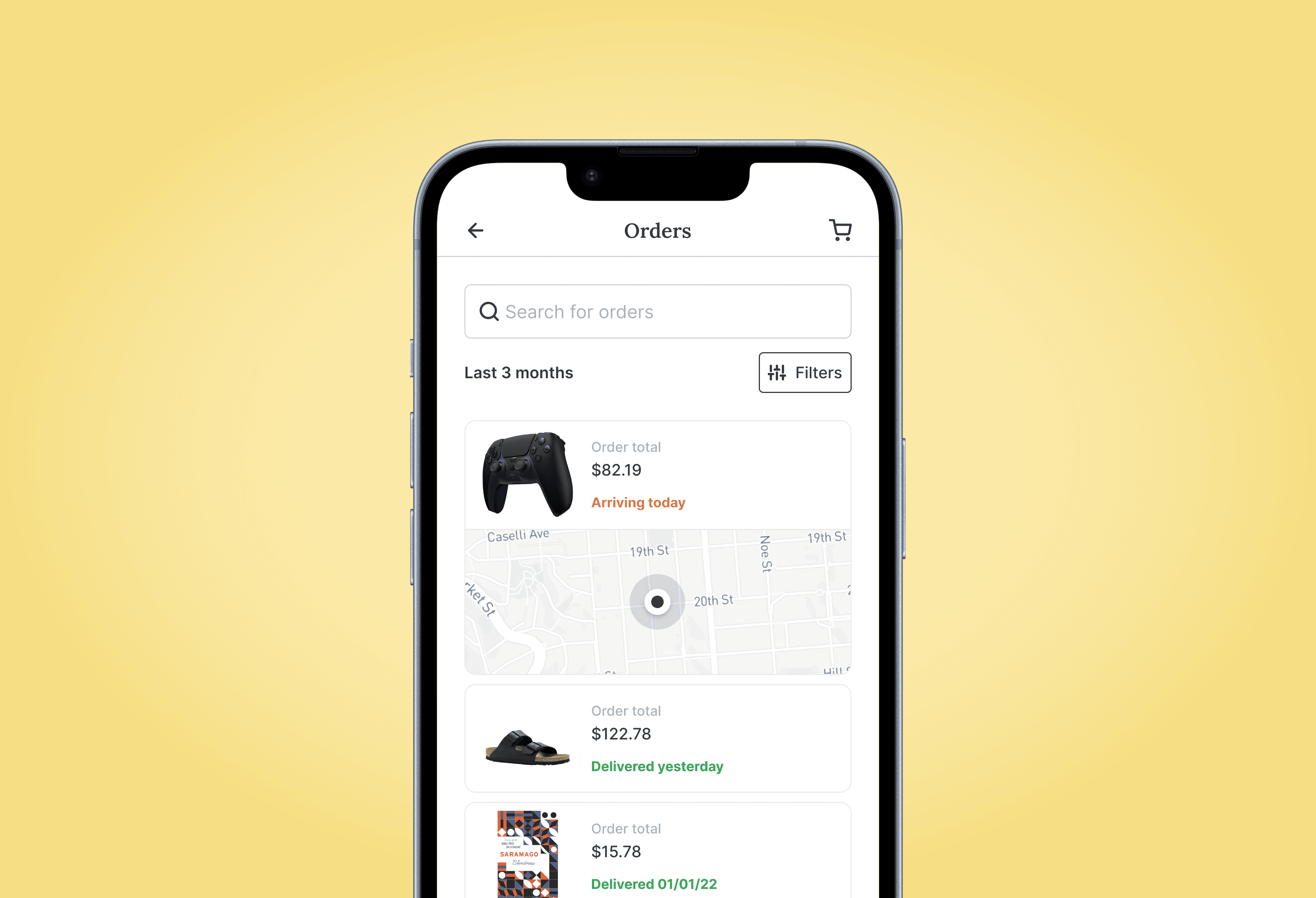
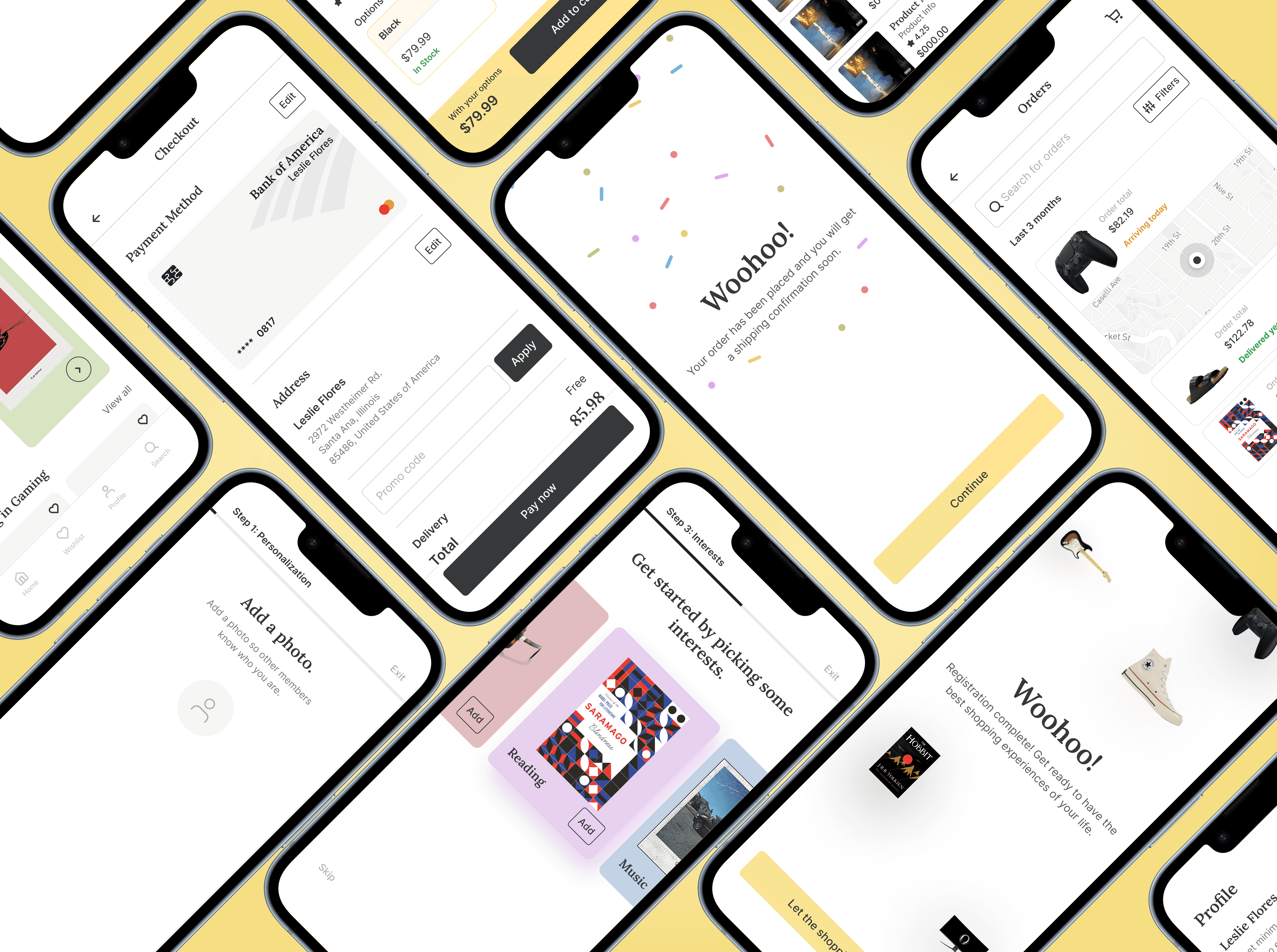
Information Architecture & Key Sections
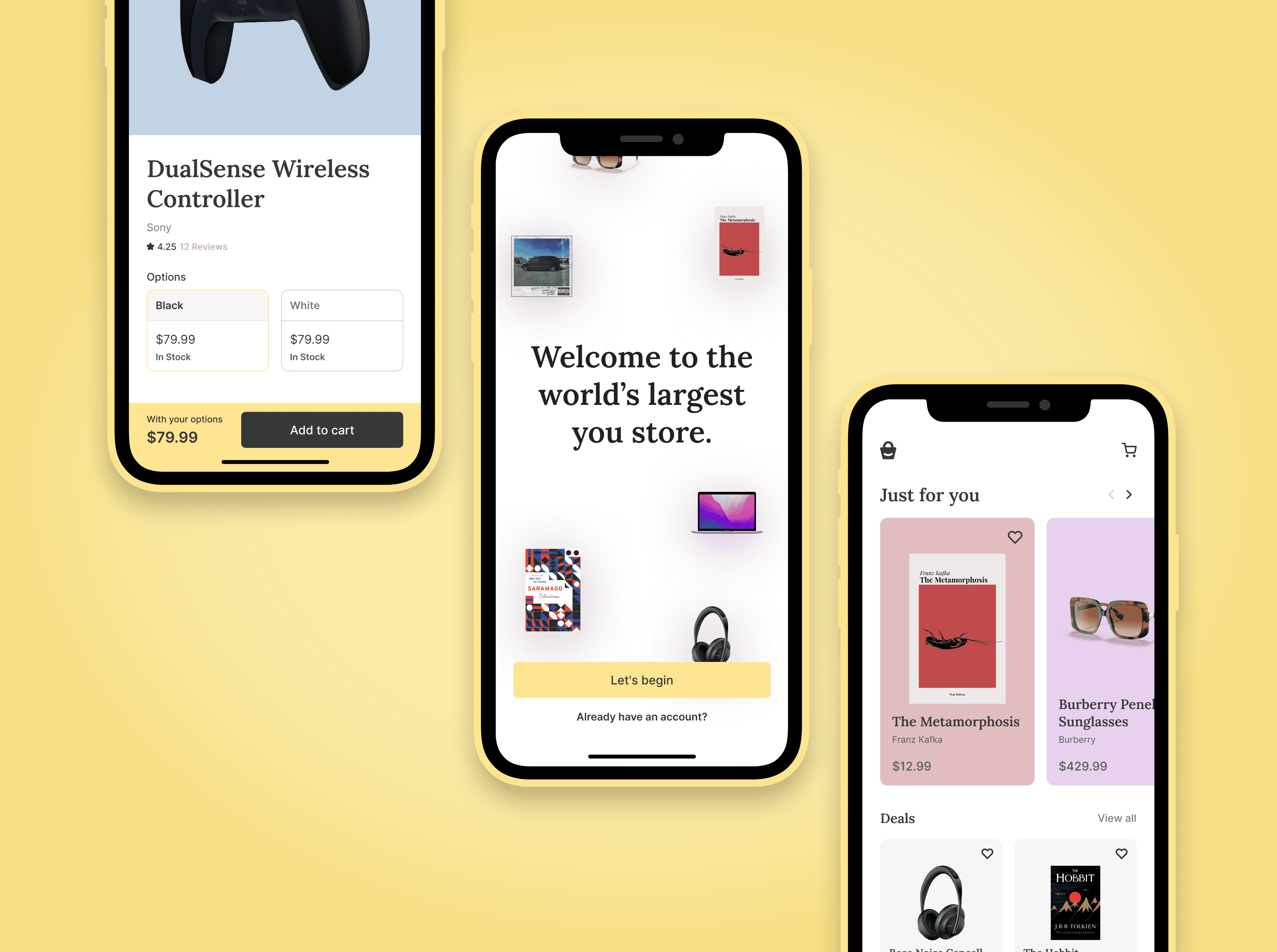
Home Screen
A warm, welcoming hero with rotating top deals — but kept minimal, not overwhelming.
Curated categories below (Fashion, Electronics, Groceries), each with a hero image, guiding discovery through visuals rather than text-heavy lists.
Sticky Navigation Bar
Anchored at the bottom for thumb comfort. Includes:
Home · Categories · Orders · Cart · Account
Product Listing
A spacious grid with large images, short trusted descriptions, price and delivery day estimates all on the card — so users don’t need extra taps to decide.
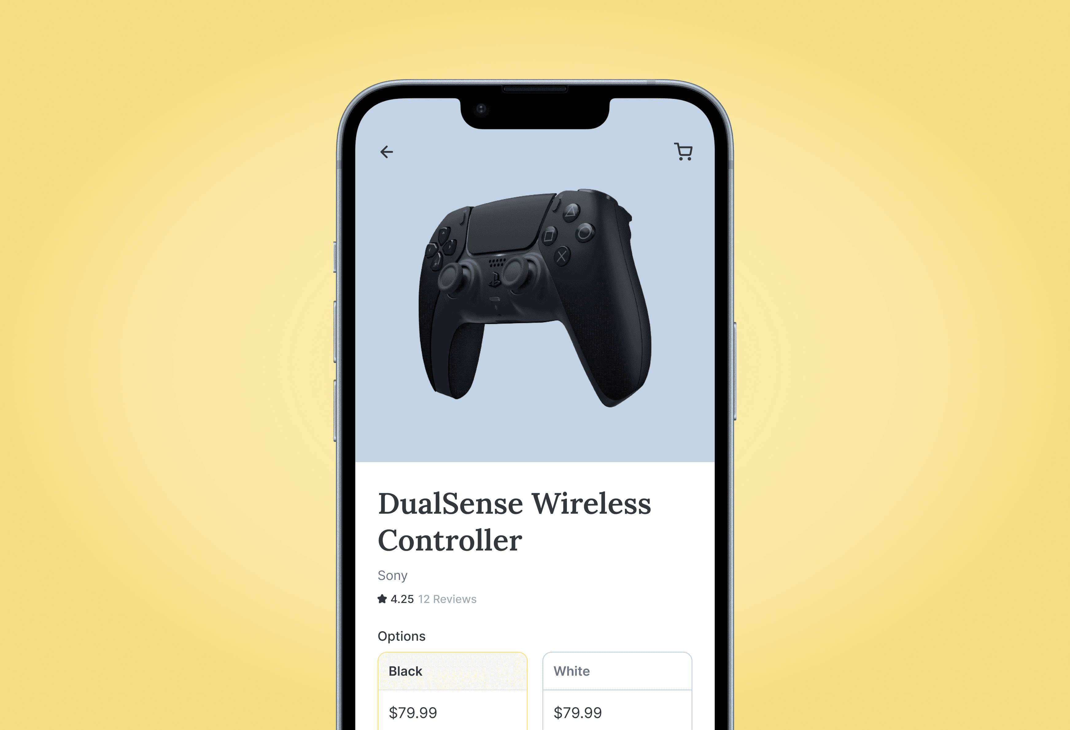
Product Details
High-quality images with pinch-to-zoom, short highlights, user reviews, and clear delivery expectations.
A sticky “Add to Cart” button remains accessible throughout scrolling.
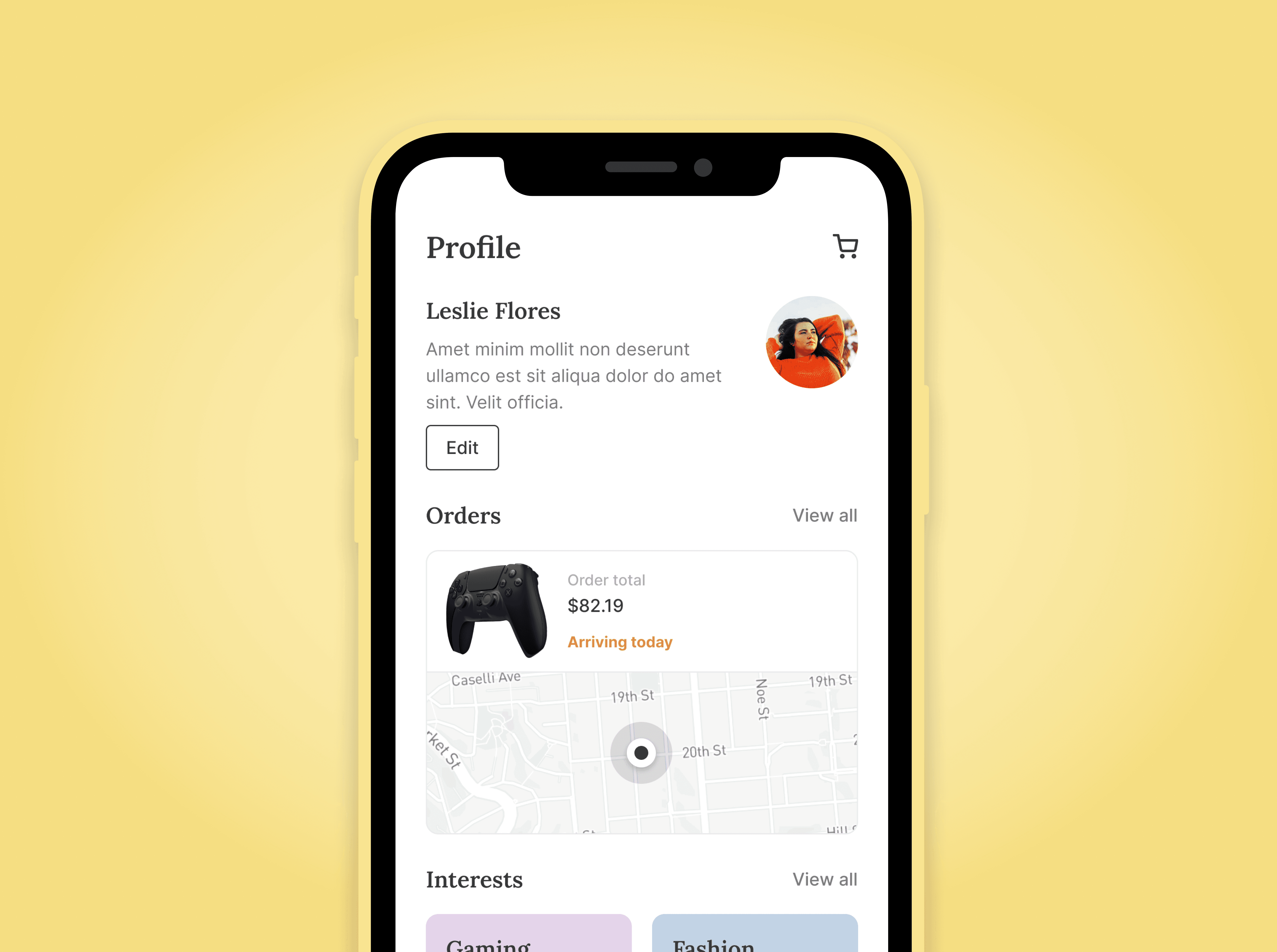
Cart & Checkout
Minimal, distraction-free with order summary always visible.
Payment options are surfaced early, and address autofill eases friction.
Post-Order
A delightful success animation with a short reassurance on what happens next.
A “Track My Order” CTA is placed immediately, to reduce anxiety.
Design System & Visual Direction
Typography: Montserrat, geometric and friendly, pairing with system fonts for fallback speed.
Color Palette: Soft neutrals with subtle brand accents. This allows product images to stand out.
Motion: Micro-animations on “Add to Cart” and transitions that reassure users their actions registered.
Layout: Mobile-first modular design, scalable up to tablet. Prioritized thumb reach zones and larger tap targets.
Outcome
The final design delivered a mobile app experience that outperformed comparable local competitors on both engagement and trust signals.
Test sessions showed:
50% faster product discovery time.
2x increase in cart additions versus traditional e-commerce layouts tested on similar audiences.
Users cited it as “less stressful” and “more enjoyable” to browse.
The design system also serves as a flexible foundation for future features like group buying, influencer shops, and gamified loyalty.
What makes users love it?
We leaned heavily into clarity, familiarity, and small surprises:
Clear delivery expectations and trust icons for reassurance.
Fast, thumb-friendly flows that reduce decision fatigue.
Subtle animations that made the process feel lively without being distracting.